AmaZin
Original Available - contact me for details
Shop Online for Archival Prints
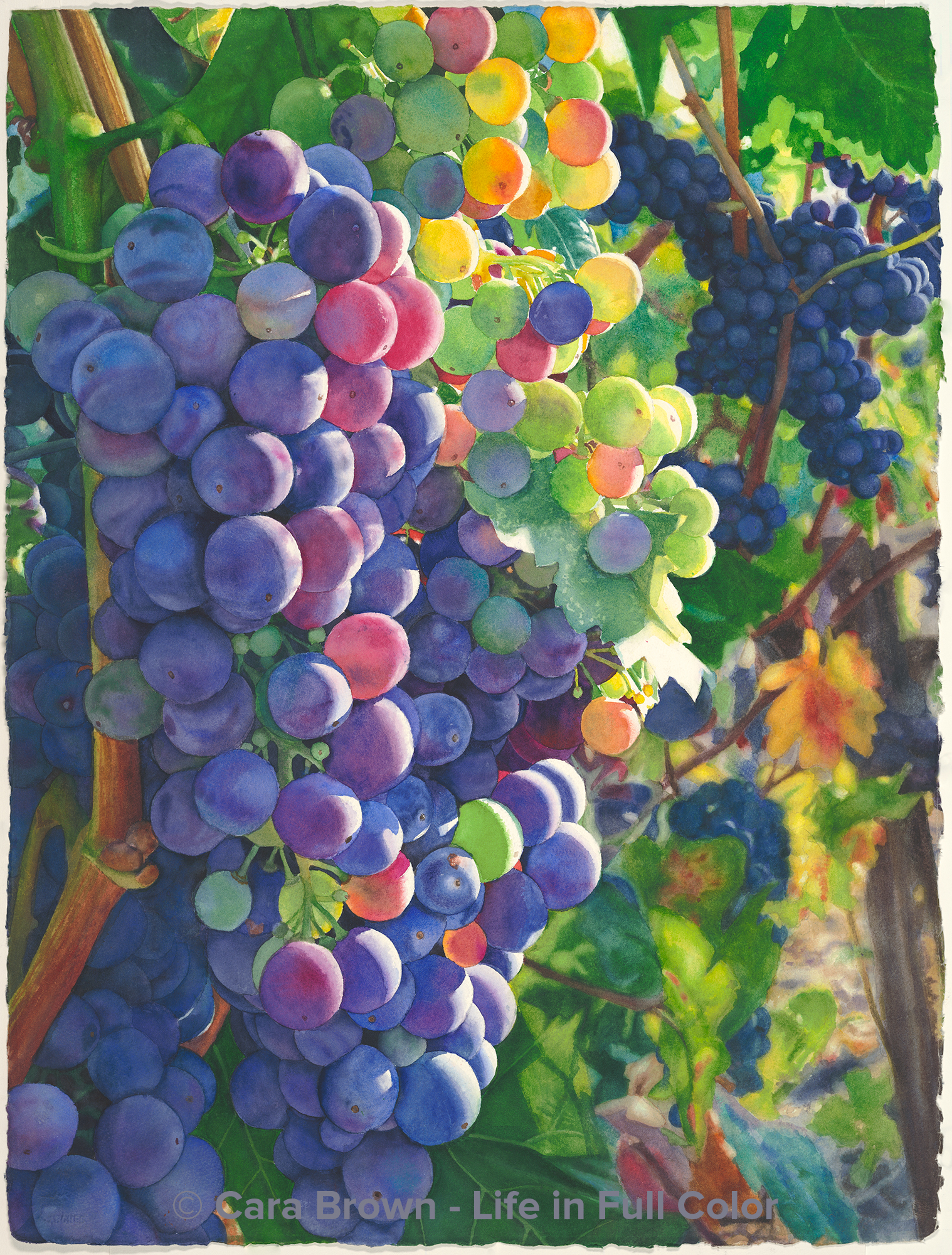
Oh, the story of this painting - nothing close to a straight line from start to finish.
I first drew it out in September 2021 and started it the next month. The final touches went down in late October 2023 - and then, only after a decision to buckle down and bring it all the way through, already!
The spirit of this painting has been patient and faithful.
The grapes are Zinfandel, from my friend Sue's ranch in Cloverdale. After Zintopia, it's my second painting from this vineyard. The way this patch of grapes is postioned on the hill, the sunlight shows off their late-summer colors spectacularly. A few more fabulous images from this vineyard wait for me in my "candidates" folder. Maybe some day...
The background is one of the more elaborate I've ever done, which took it's sweet time to come together. Somewhere in that phase I decided the way I had it composed had to change. I needed to prune some of the grapes at the bottom and replace them with leaves, covering my tracks along the way - tricky!
The photo included "markings" on the grapes - watermarks? Curiously, they were in the bright sunlit part as well as in the shadows. I painted these variations for the first time in a vineyard painting. Something new!
The name is simply me being playful. The jury is still out about whether the "Z" should be capitalized or not.
For now, we'll go with AmaZin
Completed October 2023 - 30"x22" - Watercolor on paper
AmaZin
Grapes and Wine, Originals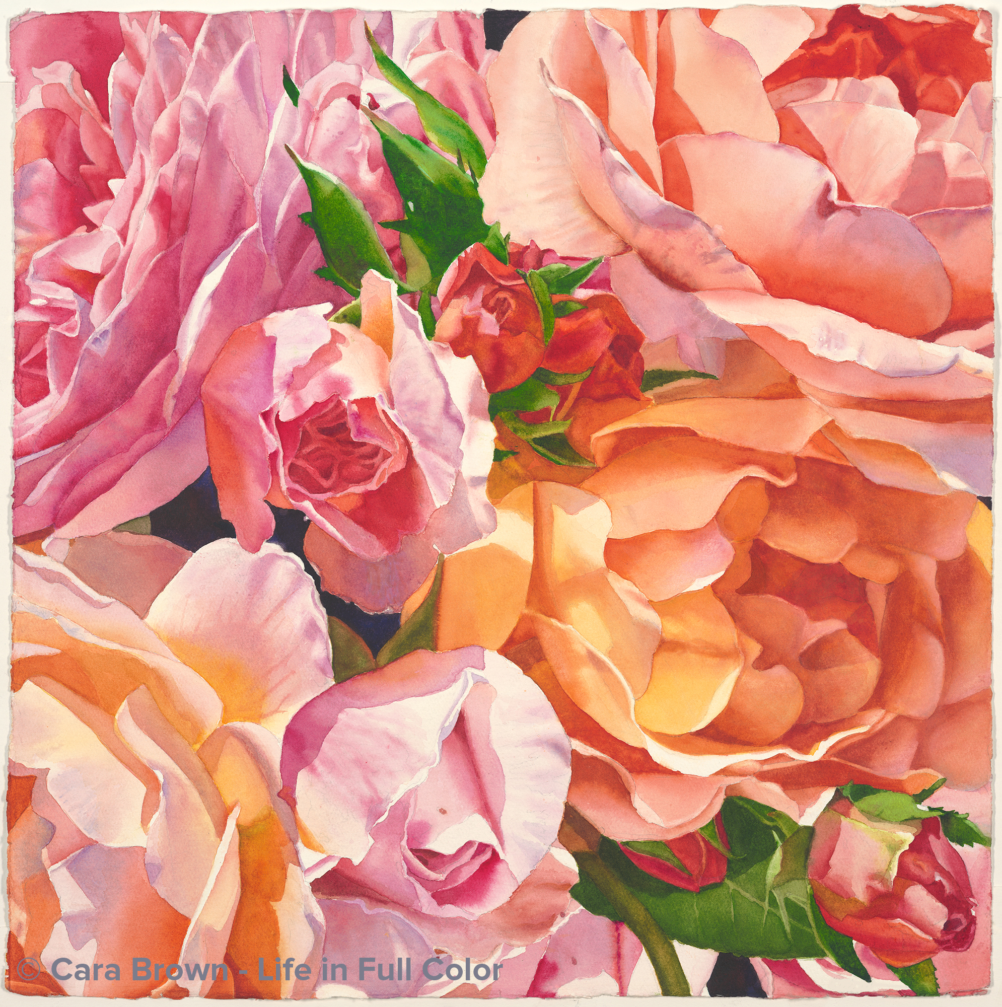
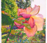
Glee
Original Available - contact me for details
Shop Online for Archival Prints
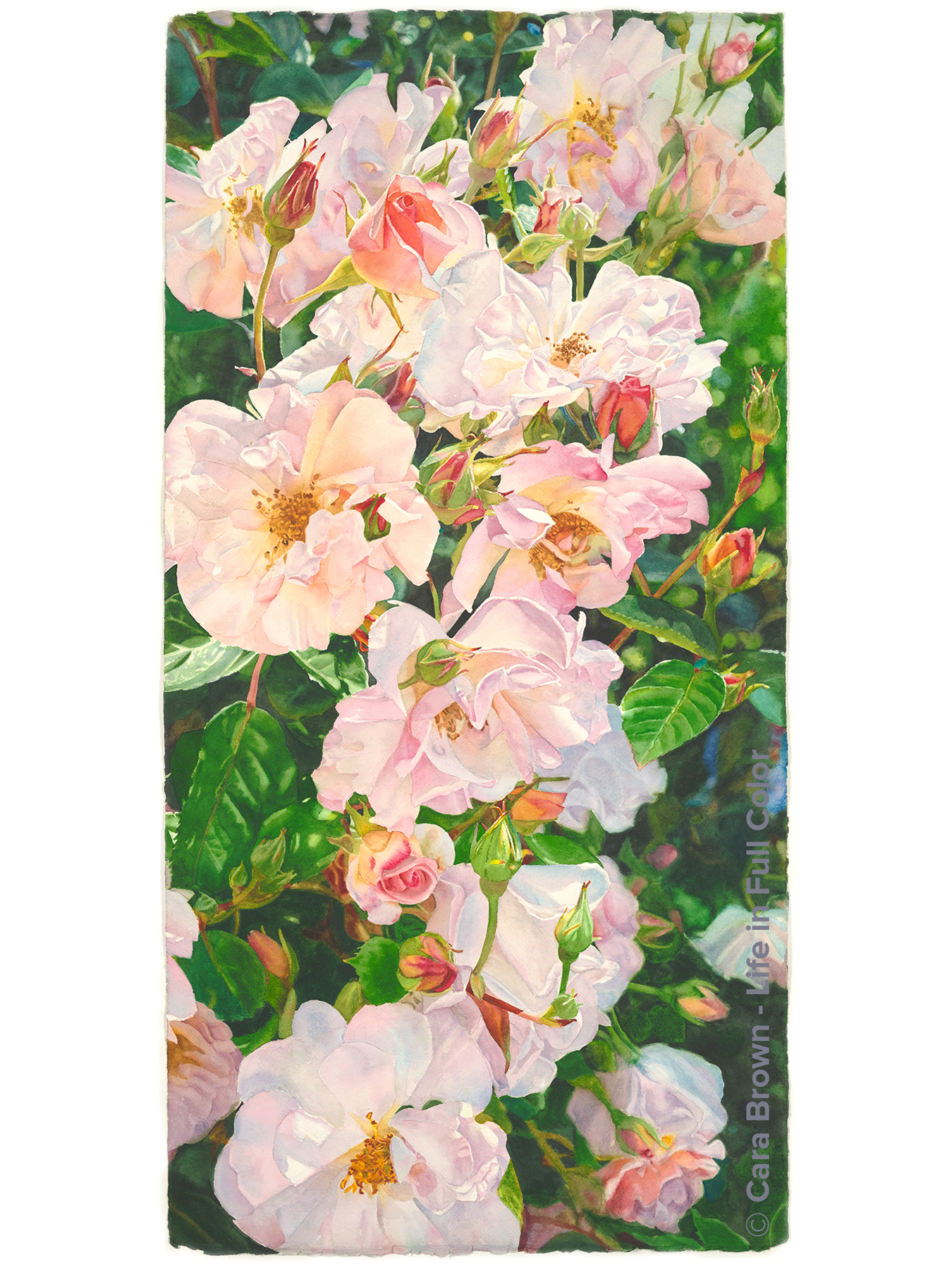
The wish for some easy, delight-filled painting time during the summer of 2023 inspired this one. Pink and orange are a very favorite color combination. There are no other flowers that get me than roses.
It's another view into the opulent boquet of roses that became Lavish. I squished the roses all in together with Photoshop, since the bouquet is years past. The bush itself is also gone. It didn't survive a garden remodel in Anne and Gary's front yard. These two paintings will have to be the rest of the story.
As is the way with making art in the real world, my fantasies about this being skip-it-y-do-da kind of painting evaporated fairly early on. The mostly orange rose, tucked into the shadow in the center-right gave me fits. I got it too dark and murky. I have come to terms with the reality that as long as I paint, there will be stuff like this I'll be faced with. There will always be parts of paintings I wish I could start back with bare paper. But, this is watercolor and the process has its limitations. Nevertheless, I am happy - enough - with it in the end.
I have no idea where the name came from, exactly. Glee just sounded right. The mood I was hoping for as I painted - and - a combination of harmonizing voices.
Summer 2023 - 22"x22" - Watercolor on paper
Glee
Make me an offer, Originals, Roses
Broadway
Original Available - contact me for details
Shop Online for Archival Prints
This is a painting that started in a tiny moment. It was early May, 2022. I had picked some roses and put them in three small vases on the dining room table. Sometime in the next few days I breezed by the dining room, heading back to my studio. It was late in the afternoon when the sun comes in the bay window on the other side of the table.
My eye caught that light! The light that was coming through the slats of the dining chairs. And it caught those petals! The petals of the roses - and - those on the table as some of the roses lost their grip on them.
Out comes the phone and its camera. I took several, moving the vases around. I've learned that it's great to have options when working with images past the time when I can take more.
Months and months pass, I periodically see the images in Photos on my phone and iPad - and think - that is SO a painting!
It took some re-arranging in Photoshop too. Even with the photos of different views, none were just right. I craved having this view of that rose and the green and blue reflections from this one... and on and on.
Painting it was all over the place. I usually am quite disciplined about painting the background first, working my way through to the roses, but I was feeling the need for rose petals to paint.
Life in 2023 has been very unsettled - with moving the studio, among other discractions from my painting, so it took a while to get through. I started it on a trip to Kauai in October 2022 (I know!) and finished it on the front porch of the little place where we stay there in May, 2023.
What to call it? I kept feeling "dance" or "chorus line." The name of the brightest colored rose, just right of center is "Broadway." (This is also the rose that became the painting I called "Nova.") It's gorgeous and fragant - one of my favorites. This is it! "Broadway" is a single word that connected with the feeling I got from in this painting. Footlights for showy flowers!
Spring 2023 - 22”x30” – Watercolor on paper.
Broadway
Flower Still Life, Originals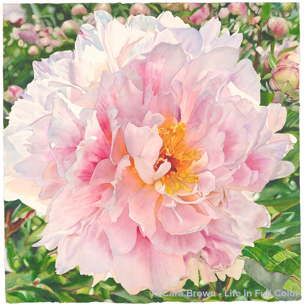
Delight
Original Available - contact me for details
Shop Online for Archival Prints
The Magnolia Artists gathered for the first time as a group - since March of 2020, in the gardens of Filoli in Woodside. It was early May 2021 and we had all received our two doses of COVID vaccine. It felt like we were safe to be in each others' presence - especially out of doors. We were giddy getting to be together - especially in such a breathtaking place.
I've not painted many peonies - and not for lack of desire. I've just not had many peony images tell me to paint them. Roses keep butting in. This is a herbaceous peony, rather than a tree peony. The herbaceous type are not quite as showy, but the freshness and purity of this one got me. I love the petal curled over towards the center, making it almost demure.
I helped the composition along by inserting the field of buds, in pinks and greens behind the top of the flower, giving a more complete picture of what it was like to be there that day.
Zoom in to the upper right corner and you'll see how our weeks-old puppy, Bozzy, added his creative touch to the piece. He scratched it with his sharp baby dog claws, which I hadn't noticed until I put paint down. This will forever be the painting I was working on at the start of his puppyhood.
The title is a nod to Ross Gay, author of The Book of Delights, a wonderful book that reminds us of how small joys are found in the every-day and how making space for delight is a worthwhile pursuit.
Plus, for me it's almost always about the light.
March-April, 2022 - 29”x29” – Watercolor on paper.
Delight
Originals, Other Flowers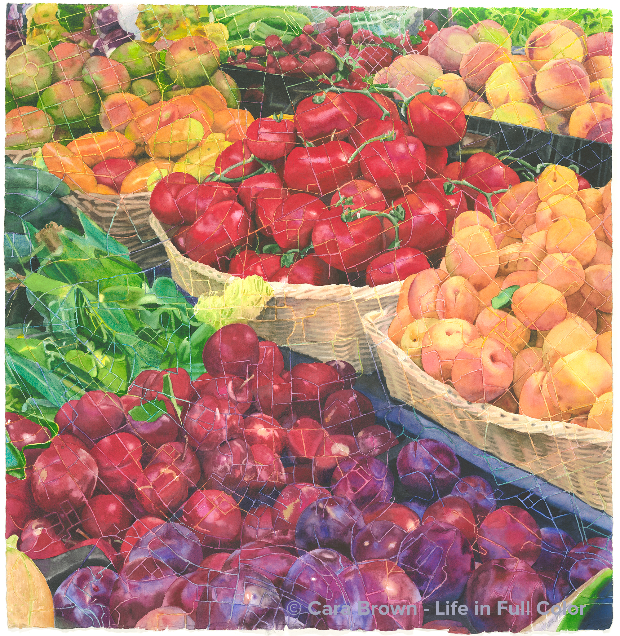
Roma
Original Available - contact me for details
Shop Online for Archival Prints
There’s so much here in this painting!
There's the trip to Europe with my family, the day walking around Rome with my sweetie and our nibling HLeigh, then the idea and the process of painting it…
In 2017, the year my sister-in-law Vernona turned 50, she organized a trip to Europe. She, my brother Joe and their four kids were doing a grand tour. When my parents signed on, I lobbied my Joe to join them - for at least some of the trip. I had a feeling it could be the last time we got to be in Italy with my dad. As it turns out it was. We savor the time we had there with all of them. And will especially treasure the time with my papa.
The trip included a trip to Rome. Dad wasn’t able to walk much, so one day, Joe, HLeigh and I set out wandering on foot. We made our way across central Rome to the Campo dei Fiori – a square that has a rich and varied history. It was the site for papal excecutions and book burnings centuries ago and has been a daily market for fruits, vegetables and fish since the 1860’s. Now it seems to be more a tourist spot than where Roman citizens do their shopping. The vibe reminded me of Fisherman’s Wharf in San Francisco.
We had breakfast at a café on the periphery and then took a walk around the square. There were some beautiful displays of produce and flowers amidst the souvenir and scarf vendors. I took photos of the splashes of color wherever I saw it, HLeigh took a drink from one of Rome’s many ever-flowing fountains and we headed on.
The prompt to actually paint it came in the summer of 2020 when “Zinoasis” - a large square painting of zinfandel grapes - sold to someone out of state. I took the painting out of the frame to ship it in a large tube, leaving me a really nice frame that needed art.
I was going to just do a straight painting of it but then on a hike it came to me to paint it through the map of Rome, just as I did the flower stall through the map of Paris several years ago.
The first thing was to figure out what part of the map to use and at what scale. My math head came in handy to figure out the scale of the Paris map painting – 2.7 kilometers, square. And HLeigh’s friend Livia, who is a bona fide native Romana gave me feedback on the section of the map.
Now for the real challenge! I chose to draw and paint it just as I did “Paris” – no contour drawing for the actual shapes. The only pencil lines on my watercolor paper were those of the map. Each plum, tomato and apricot were eye-balled from the map superimposed on the reference image. And I avoided the lines of the map with my brush; no masking fluid!
I do believe this is the most difficult painting I’ve done to date. I had to make each object read as contiguous and three-dimensional, even as each one was painted in separate sections. And those baskets put me through it!
The name of this one follows the lead of “Paris” Rather than call it “Rome,” I decided, when in Rome… call it “Roma.”
A fun bit of synchronicity: the beautiful frame that has been waiting for this painting is made by an Italian company called Roma.
29”x29” - Spring 2021 – Watercolor on paper.
Roma
Fruit, Originals, Squares-Maps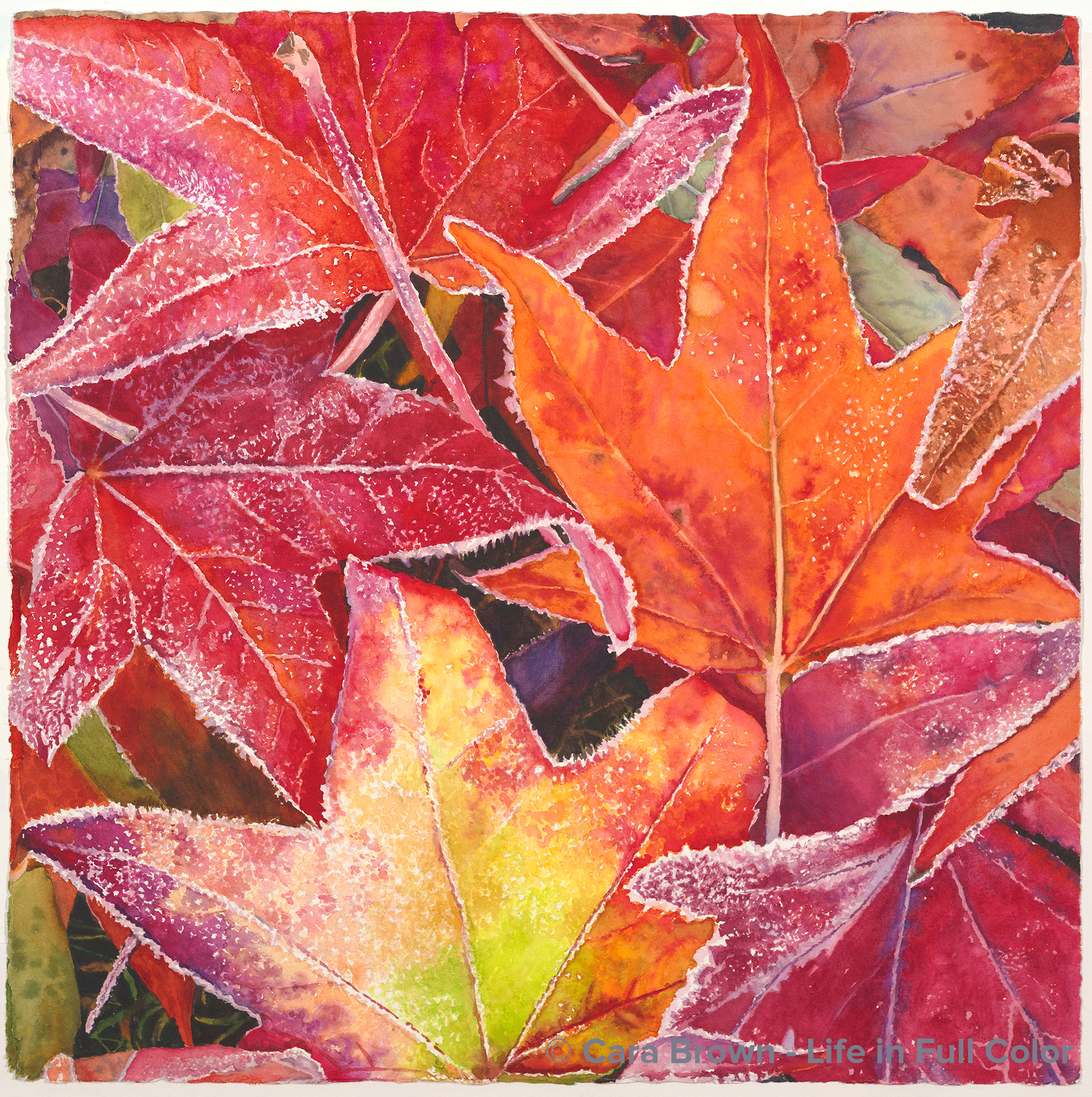
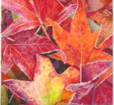
Returning
Original Available - contact me for details
Shop Online for Archival Prints
This is one of those paintings that come from mining the treasures I collect and hold on to (sometimes for a very long time) before making them into paintings.
The timestamp on the photo is December 2006. I was coming home from hiking the hill near our house with our dog BJ. As we walked by the house down the street, the lawn next to the sidewalk was strewn with the leaves from their liquid amber trees, iced with frost.
My eyes landed on this one vignette of overlapping and turning leaves. Even though this is not a rare occurrence, I’m still amazed at the wonderful mystery of how we are caught by something so specific within a sea of visual information. It’s as if I hear “this, this, look at THIS!”
I dashed home for my little Canon Elf camera – this was pre-iPhone – to capture it before the sun came up enough to melt the frost.
Two forms of hesitation have kept me from painting it all these years: first, how am I going to take on painting this? All that frost! And then: who is going to want a painting of ice? Most people are drawn to all the warmth and sunlight in my work.
But I appreciated the fire-and-ice quality to it – the warmth even in the cold. So, there it rested, patiently, in my “candidates” folder.
When the world shut down and we all stayed at home the spring of 2020, there were two more Saturdays on the schedule of a “Basics and Beyond” series I was teaching. With the shift to Zoom, I felt compelled to come up with a new group exercise, since I couldn’t support each student working on a painting of their own choosing, as I do when we are in-person.
I decided to use a piece of this image for the session called “Lost and Found in the Details.” In the process of demonstrating how I’d paint the multiple colors around the white spots of the frost, I found myself really liking the result – and having fun!
Adding to the impetus to do a full painting of these frosty leaves was the idea that came to me to create the 2021 calendar with paintings of images that were captured within walking distance from home – the beauty found right here in our neighborhood.
The name has a few connotations: returning home from the hike, returning to capture the image of these leaves as they are returning to the earth at the end of the season. We turn and re-turn.
22”x22” – April 2020 – Watercolor on paper
Returning
Make me an offer, Originals, Shell and Leaves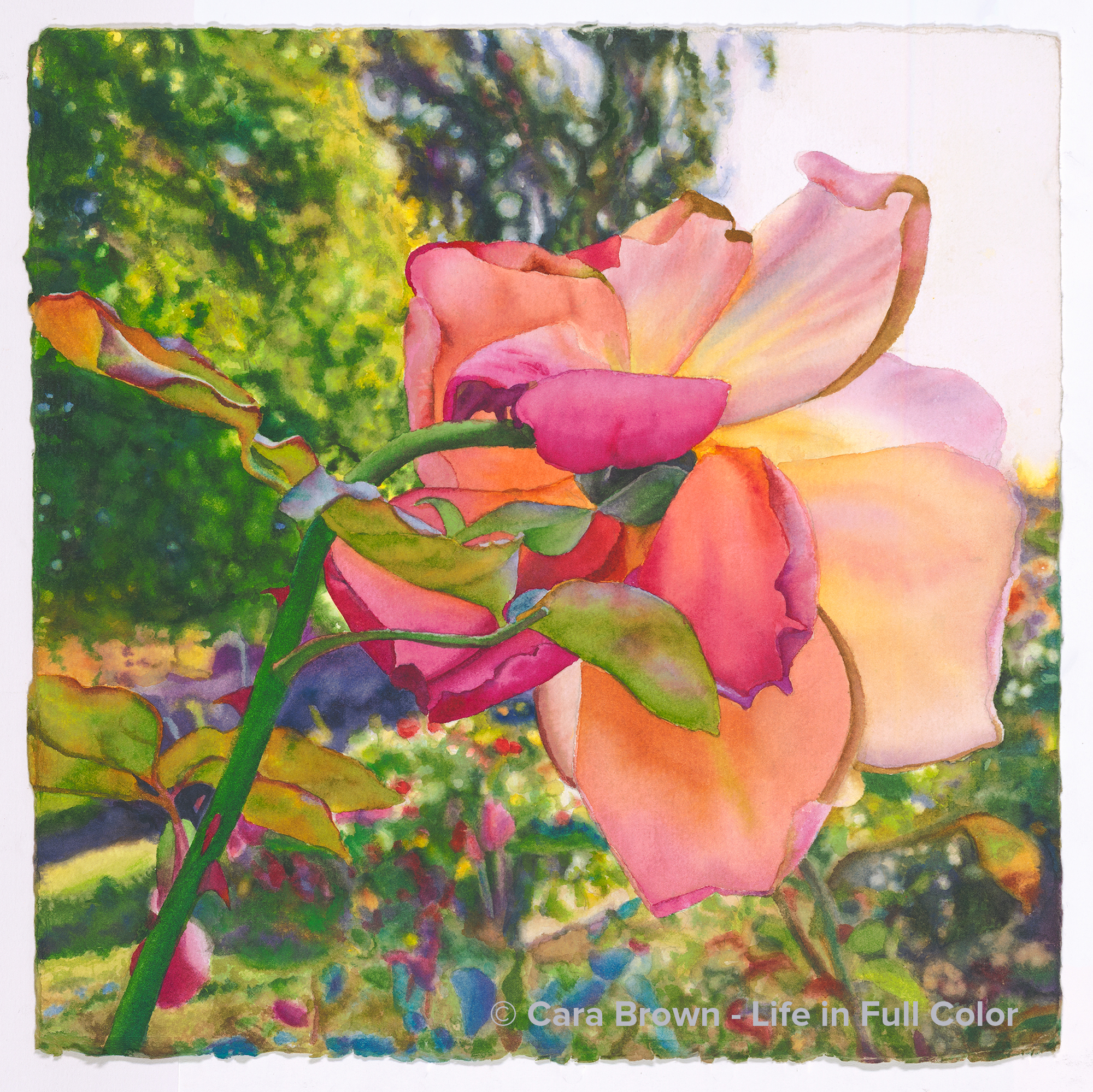
Farewell
Original Available - contact me for details
Shop Online for Archival Prints
On the way back from a late autumn trip to Tahoe in 2015 we made a stop at UC Davis Med Center in Sacramento. John, Joe’s flying mentor, who had COPD, had gotten sick. It progressed into pneumonia putting him into the hospital with the expectation that he was likely not going to come back from this one. Since I’d only seen John once or twice in passing, I stayed away while they had their time together.
Right next to the hospital was a lovely rose garden, giving me plenty to occupy myself with. Though it was late in the season, and some of the roses were about finished, there were still quite a few that had painting-promise.
I followed a honey bee around for a while – always happy for the prospect of another rose+bee painting. But this was the image that won out. It’s not the first under side of a rose that told me to paint it, but this one had two-tone color, cute curled petals and a crazy-fun - but super detailed! - background to add to the allure.
I started painting at the beginning of 2018, but this one mostly sat on the back burner for two years. I brought out to work on it on only I needed something small enough to paint at the beach on Kauai – that is - until the start of 2020 when I thought: Ok, it’s time to get this one done! We were on Kauai again in January and I added yet more sand to my tiny travel palette as I hopped with my brush around the petals and leaves at the beach.
John left his earthly body a few days after Joe’s visit. Though he was still here when I took the photo, I see the rose looking skyward, following John’s final takeoff. We are all here such a short time, even if we get to live to a ripe age. Never before in my life has this felt more real as it does now, as I write this in June of 2020.
I see this brightly colored, late-season rose as a reminder that we can really live - be really alive - all the way to the end, just as John did.
2018 - 2020 - 15”x15” - Watercolor on paper
Farewell
Originals, Roses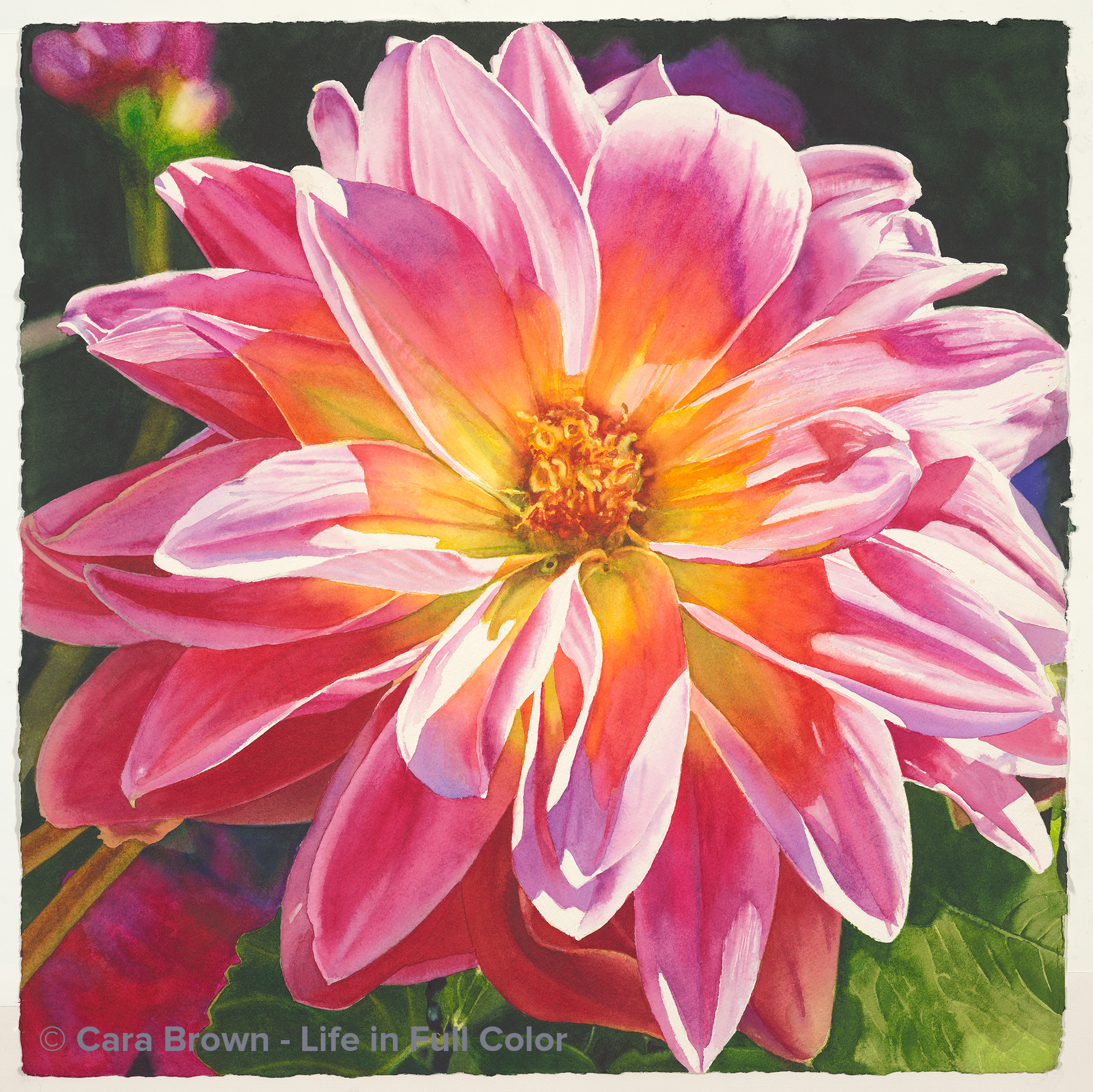
Hello
Original Available - contact me for details
Shop Online for Archival Prints
There are pieces of art I've made that have held lots of meaning, some of them have become "important" even before I've started painting. This one, not so much. I decieded to paint it just for the fun of it- the colors, the light, the simplicity. And since I can be such a serious and purposeful person, this is really good for me!
I took the photo more than 10 years before painting. I noticed this sweet flower along a path in Anne and Gary's garden - the same one that is the source of my peaches and apricot paintings, as well as the gorgeous roses that became "Lavish" in 2019. This dahlia was a tiny little thing, not more than 4" across. In reality it was all pink, except for a golden center, but I had to mess with it, addig more orange, to make it sort of tutti-frutti - just for fun.
Pam, an artist in our Friday group, helped me with the title. Just about finished, I had it up on an easel in Larkspur. She walked in the door and said "Well that's a big 'hello'!" Funny, I was considernig calling it "Hello" but was, as I often am, doubting it. I love having my inclinations accidentally affirmed! So, just after finishng a small rose painting I called "Farewell," here is "Hello" - marking the partings and greetings of life.
January-February 2020 - 22"x22" - Watercolor on paper
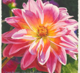
Hello
Make me an offer, Originals, Other Flowers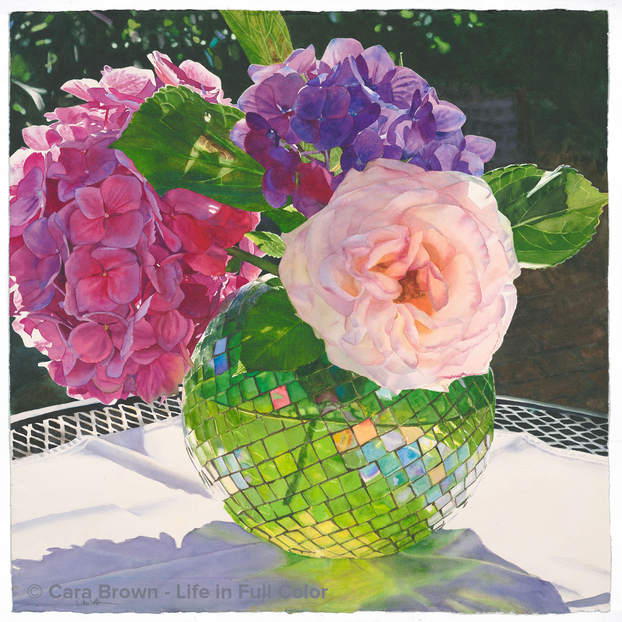
Fascination
Original Available - contact me for details
Shop Online for Archival Prints
Inspiration and energy to make these watercolor paintings have been relatively steady resources in the past dozen or more years. I have a folder of “candidates” - photos I’ve taken that have given me the message they are worth spending my time on. Most of the time when going through this folder, looking at all these beautiful pictures, I can imagine myself jumping in to start painting pretty much any one of them. My problem is not having enough time.
But after finishing “Aria” in July, I was fresh out of something to paint and a look through my candidates left me totally flat. I spent 2 or 3 days digging through the rest of my image library looking for something that I may have overlooked. I never know when something from a while ago will reach out and grab me by the throat (ok, by the heart) - as it did with both “Sherose” and “Lavish.” Even there… nothing.
The thoughts were scary. Uh, oh. What if the inspiration well has run dry? What if I can’t paint flowers, fruit - all the stuff I’ve loved to paint for two decades - anymore, then what?
Then I went to my friend Samantha Davidson’s. Sam gives the most heavenly facials on Earth. On my way out the door, all tension drained from me, I saw this amazing faceted glass bowl, about the size of a cantaloupe, on her dining room table. It had a single stem of a pink hydrangea in it. The way the squares of glass caught and reflected the light, all the colors and iridescence! My gosh! It HAD to be painted!
Sam happily lent it to me. I came home and found a few things in the garden, waited for the sun to dip a lower in the sky and took several dozen photos. It felt great to come alive, to have something I couldn’t wait to paint!
I let myself pull out all the stops in Photoshop: use the image with the most colors in the pieces of glass, and then add in a few more; use the one that had a break in the flowers to keep it from being too heavy, add a leaf at the top to carry the eye skyward, and of course shift the colors to give myself maximum joy.
As I watched myself paint the glass itself, I realized how important it is to really paint what I see. The grid-like, linear aspect of this would make it really easy for my left brain to jump in and “organize” it all. In order to make it look real and alive, I had to let the uneven borders, bending lines and diminishing sizes and proportions be as they were, in order for it to really live.
Our Tahoe vacation was busier and more distracted than normal, so I came home having made very little progress and with a fire under my butt to get it finished in time for the Sausalito Art Festival. I took it on a camping trip in mid-August and even painted it on the picnic table in our dusty Russian River campsite, by (LED) lantern until well past dark. I was determined to get it done!
Somewhere in the last couple of days working on it the title sifted in. The root of the word “fascinate” in Latin is connected to “spell” and “witchcraft.” When overcome by the hunger, the need to paint something like I did this one, I do feel bewitched. That the word “facet” has a similar sound doesn’t hurt either. Here it is - meet “Fascination.”
August 2019 - 29”x29”– Watercolor on Paper.
Fascination
Flower Still Life, Originals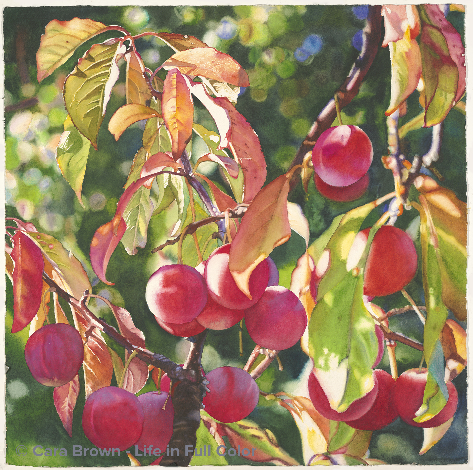
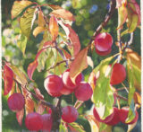
September
Original Available - contact me for details
Shop Online for Archival Prints
Walking back up our street after a hike up the neighborhood hill with the dog, I saw fruit on the plum tree. Not unusual, plum trees do bear fruit. But this was in September! Normally the plums are gone by at least mid-August. The leaves were starting to turn colors already.
The sight of the autumn leaves along with the reds, pinks and even violet colors in the fruit, still moist with the morning - was just beautiful. So, I came right back with the car, a ladder and my camera to take a bunch of pictures.
All of this was 5 or 6 years before any painting happened. None of the images were painting-ready from the get go. I spent hours and hours in Photoshop collaging, removing, adding. I loved the colors and the leaves. Still, something was missing.
A Saturday workshop on fruit had me hunting for something to demonstrate on - and I thought: what the hell? I started it for a workshop late in 2017 and then it was usurped by other paintings that insisted on coming through first.
As happens, after it sat patiently unfinished in my studio, I found renewed energy for it. It was high summer and I needed something colorful to work on. The background was fun - a particularly lively fuzzy background where I felt free with color and shape. This is the first thing I've painted where there were out-of-focus elements in both the background and the foreground.
The magic in this painting continues to be the fact that there was still fruit so late in the season. It's not happened since - I've been paying attention. That was a special year. I'm happy that it's been memorialized. Cherry plums in September. August - September 2018 - 29"x29" - Watercolor on paper
September
Fruit, Make me an offer, Originals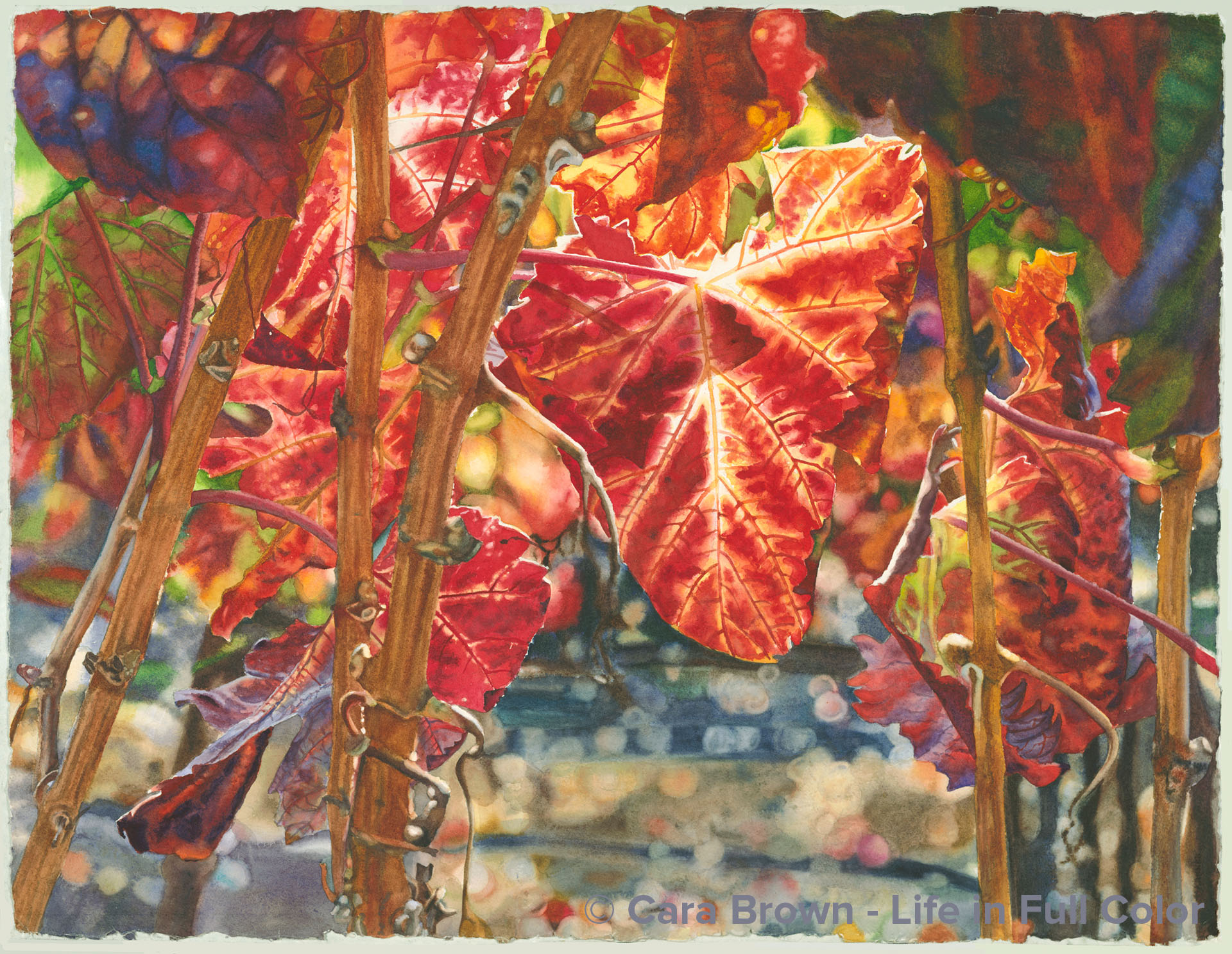
Napa
Original Available - contact me for details
Shop Online for Archival Prints
These leaves were on the side of Highway 29, the main route through the Napa Valley - it was late November or early December and I was coming back from a lunch at Greystone in St, Helena with Joanne - a dear friend visiting here from Boston. The afternoon sun this late in the year was already fairly low in the sky. The sunlight caught these leaves on the side of the road - making the reds and yellows incandescent. I am obedient to inspiration, so I pulled over on the rough shoulder and climbed between the wires of the fence with my camera.
As almost always happens, of the dozens of pictures that I snap (grateful for the freedom to do that with digital photography), one or two stand out – this was one of them. But a reluctance to paint it was there too. There were no grapes… the main leaf is curled and does not have much of a “grape leaf” shape… and through the bright colors and the lovely light, I felt a certain melancholy. I remember saying this image made my heart hurt in the best way. Who would want a painting of melancholy?
Fast forward a lot of years to October of 2017 when a great firestorm raced through this part of our world… I was painting some white wine grapes from an image I’d snapped on the side of Highway 12 in Sonoma – the Valley of the Moon. In the midst of the devastation and grief everyone around here was feeling – especially because of how beloved these areas are - it occurred to me to call the painting of Chardonnay grapes “Sonoma” and be brave enough to paint this one and call it “Napa.”
Being a meaning-seeking junkie, I had to know if the name Napa means something. It turns out the origin of Napa is a mystery. So it will have to suffice that these paintings are simply my connection to these beautiful valleys.
November 2017 - January 2018 - 22"x30" - Watercolor on paper
Napa
Grapes and Wine, Make me an offer, Originals, Shell and Leaves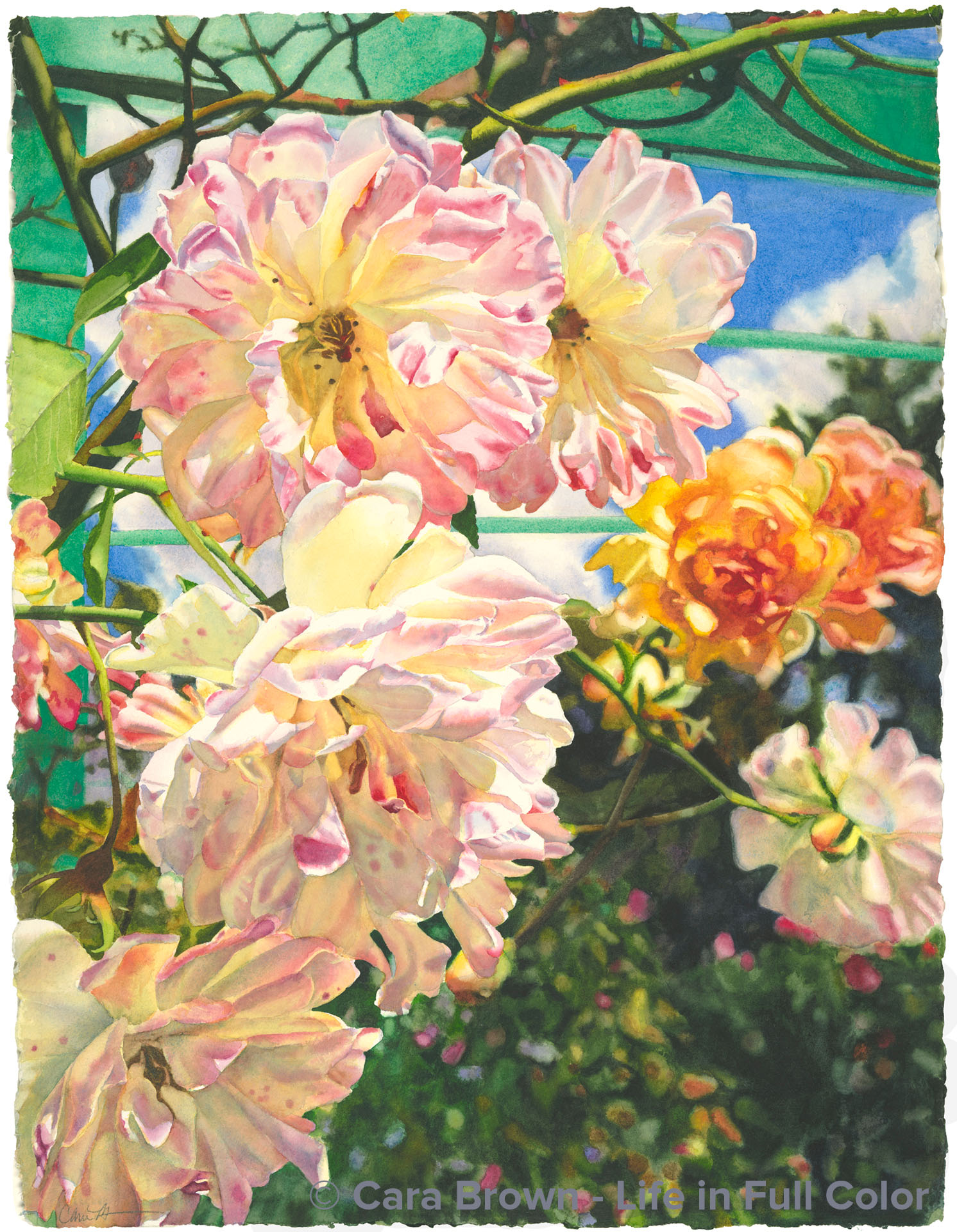
Flourish
Original Available -contact me for details
Shop Online for Archival Prints
On the last day of the Pilgrimage to Paris I led in 2015 four of us took a day trip to another place of inspiration - Monet's gardens at Giverny. It had been rainy and cloudy all week, but that Friday was spectacular with blue sky and puffy white clouds. My previous two visits to Giverny were both in the springtime, so I wondered whether there would still be much in bloom in autumn. I was happy to discover there was plenty of color - with dozens of varieties of dahlias at their peak, as well as the beginnings of fall color in the big, established trees that surround the lily pond.
So what did I need to paint first? Roses, of course! I'm pretty hopeless in my devotion to them. These late-season blooms were cascading down from a vine on the large turquoise arbor-like structure in the part of the garden towards the house. They had arranged themselves in a lovely composition and the splashes of color and rich greens in the background were a nice contrast to the delicately colored petals. The deal was sealed by the blue and turquoise in the colors of the arbor and the sky.
When I paint I'm more of a mixer of color than a layer-er. My brush hits different wells on my palette bringing various colors to a spot in the middle until I come to the color in my mind’s eye. But the shadowy parts of these roses told me to try something different. I was concerned that if I mixed too much I might end up with dull, dead colors. So I decided to layer using just three paints: a rose, a yellow and a soft blue.
I painted in that order: I first laid down rose where I saw it - either on its own or under yellow. Then where I saw yellow, then blue. There were a few places where I just had to mix - the dark neutral browns, but I still used only these three colors to mix - The five central roses were done with strictly three paints.
At first I thought the name might need to be something that would intimate the French connection. Starting with the French word for flower: fleur, I found my way to fleurish, which is cute, but a bit much. When spoken the sound of fleurish is very close to flourish, which has other meanings as an expressive gesture as well as to grow vigorously, which both fit.
May I introduce you to Flourish?!
June-August 2017 - 30"x22" - Watercolor on paper
Flourish
Make me an offer, Originals, Roses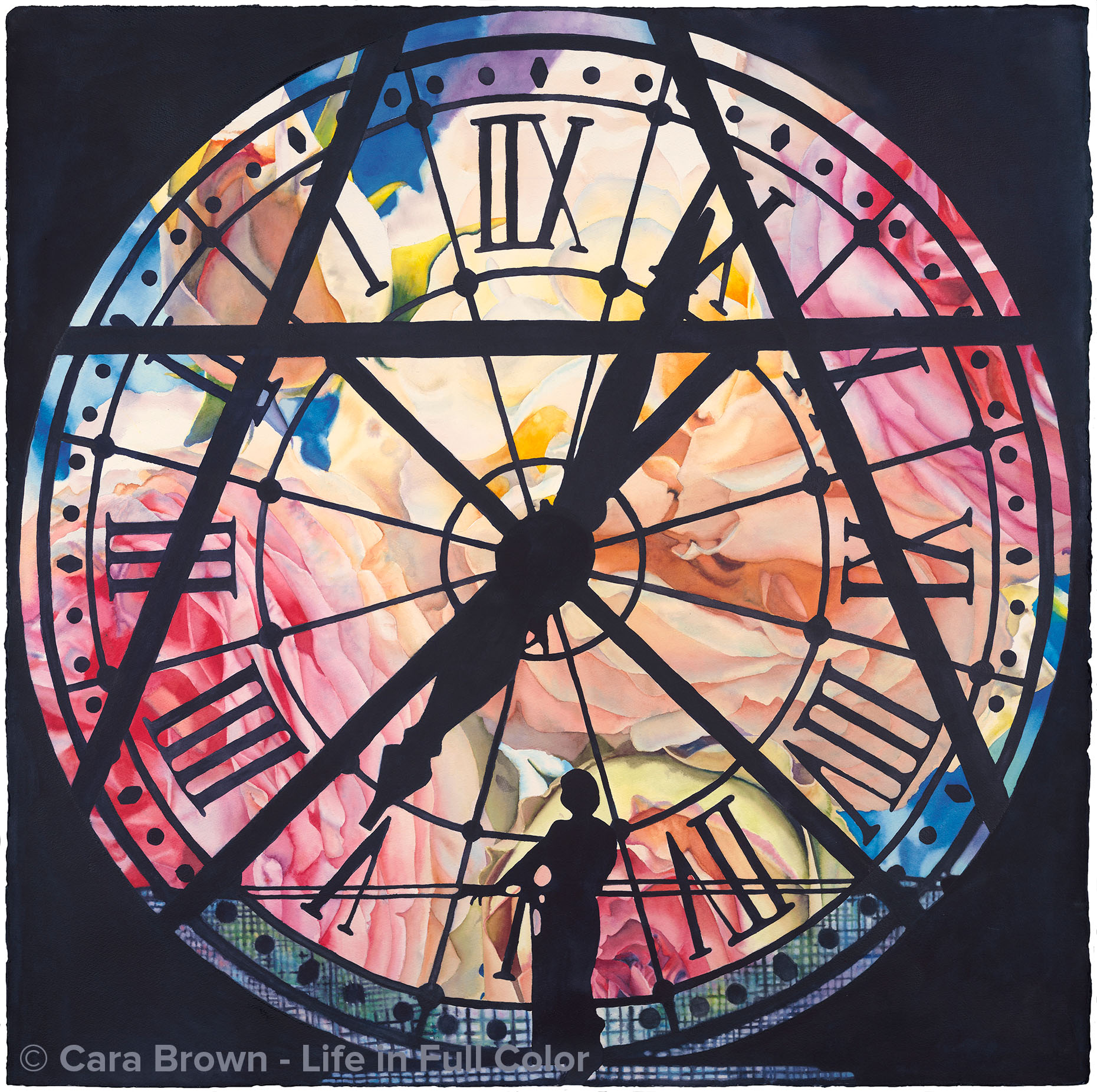
Eternal
Original Available - contact me for details
Shop Online
Archival Print Sizes/Prices:
29"x29" - $650
22"x22" - $395
15"x15" - $195
7.5"x7.5" - $60
There is so much to say about this painting! I've written a journal post about it while I was working on it. In this post I share the time and place of the source images and the progression that led to the idea to paint it. Rather than repeat that here, I'll share the process of actually creating this painting. The creative work for some of my paintings actually starts in Photoshop, piecing together parts of several photos. More than any other, this one was defined as a piece of digital art first. The original photograph, of me - standing in front of a clock inside the Musee d'Orsay in Paris - has substantial parts of the clock blocked by the structure of the building and the clock's supports. I wanted to include some of this structure, to keep the spirit of place, without having it be too heavy and encumbered looking. Since, in my painting, I don't make it up as I go, I needed the reference image to be well defined and refined before I even started drawing - which took many hours. Before drawing it, I shared the image with many people in my life, generating enthusiastic responses across the board as something altogether different for me - a new phase for my work. It was my niece Leigh who said she could see it really, really big and up on a ceiling. There does seem to be something cinematic about this image. The largest paper - in the heavy weight I like to paint on - dictates that I needed to paint this one at 40"x40". In any case, painting it a lot larger would pose all kinds of logistical hurdles - that I'm not sure I'm ready for!
In my exploration of color and how it works, I've been curious about what might happen if I paint something using just three primary pigments. I used Phthalo Blue, Quinacridone Rose and Hansa Yellow Medium, which are very similar to the cyan, magenta and yellow in inkjet printers. Even the "black" in this painting is mixed from those three paints! The experience of painting this with just three colors was incredibly instructional and even in an odd way, freeing. If I needed to make a brown, or a dull, dark blue, I didn't have to look to all the other paints on my palette, I had to find the color "solution" with just those three.
The name for this painting came out when I showed the finished reference image to Sister Mary, my spiritual director. She used the word "eternal" in response, which jumped out at me as the painting's name. She described all the symbolism in it: the suggestion of a triangle indicates the Trinity, the roman numerals represent the human hand (one of the painters in my group noticed that the four is actually IIII instead of IV!), the X evokes the St. Andrew's cross. And then, of course the rose which, besides being an anagram for "eros," is so filled with symbolism and meaning. I find it remarkable that the little girl who ran around barefoot all summer and played hide-and-seek after dark with all the boys in Woodacre, is this feminine image. Most of my life I've had no idea that she was in me! I've learned from Alison Armstrong that the feminine is all about the eternal, yet we live our lives in a physical, time-bound world. It's all here in this image - the eternal feminine framed in temporal world, supported by the masculine structure. Over a hundred years ago, there was a day when this clock first started keeping time; there will be a day somewhere in the future when it will stop, and in between, infinite moments when beauty can bring us into the experience of eternity.
February - March 2015 - 40"x40" - Watercolor on paper
Eternal
Originals, Paris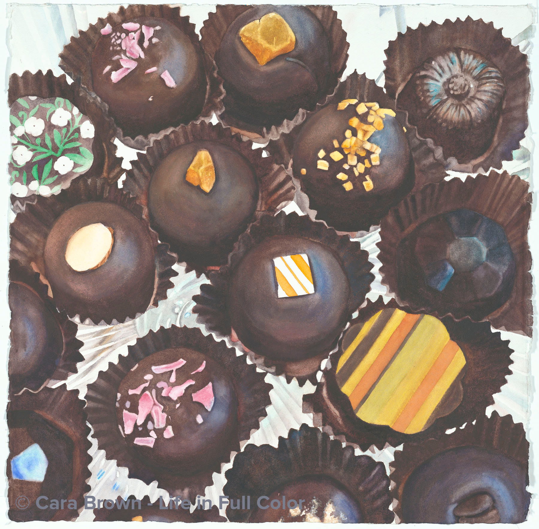
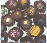
Chocolat
Original Available - contact me for details
Shop Online
Archival Print Sizes/Prices:
22"x22" - $395
15"x15" - $195
7.5"x7.5" - $60
Beverley Terry and I met at the Healdsburg Art Festival which resulted in my painting her dog Icarus. Then, she came for a while to the Tuesday watercolor group to learn watercolor and painted dogs herself (photos of them are in the art journal, late 2012). She also works at Wine Country Chocolates in Sonoma. She regularly and generously shared the gorgeous and delicious chocolate truffles they make and sell there with all of us on Tuesdays. We do miss her and her fabulous wit and paintings - as well as the chocolates - now that she doesn't come anymore!!! But when I saw the first of these truffles, I immediately thought they needed to be painted! I set them on a footed glass cake plate so the light would come through the bottom and took some photos. I started painting this earlier this spring when everyone else was painting roses and tulips but the mood just wasn't right for rich browns. I picked it up on our summer trip to Tahoe. I was challenged to stay engaged - I'm *such* a color junkie, that all the brown wasn't doing it for me - plus something funny was happening with the paints where the reds settled on the top of the wash, giving it an off cast - too ruddy for chocolate. Manganese blue hue to the rescue!
The other hurdle was the need for them to be smooth and I was painting in a very dry environment in the mountains where my washes were drying faster than I'm used to. This one put me through the paces! Painting all the toppings was fun - the colors and shadows - which really brought me alive and engaged with the piece - at last.
Back at home, I showed it to my mom and asked what I should call it. "Chocolat" she said thinking of the movie with Juliette Binoche and Johnny Depp. I LOVE that movie! It's a favorite genre - the intersection of food and the mystical. "Like Water for Chocolate" is another. Here's where I'm suggesting this painting take you - to that place where the heavenly taste and smell of chocolate can transport us. Like no other substance on earth.
July 2013 - 22"x22" - Watercolor on paper
Chocolat
Make me an offer, Originals, Sweets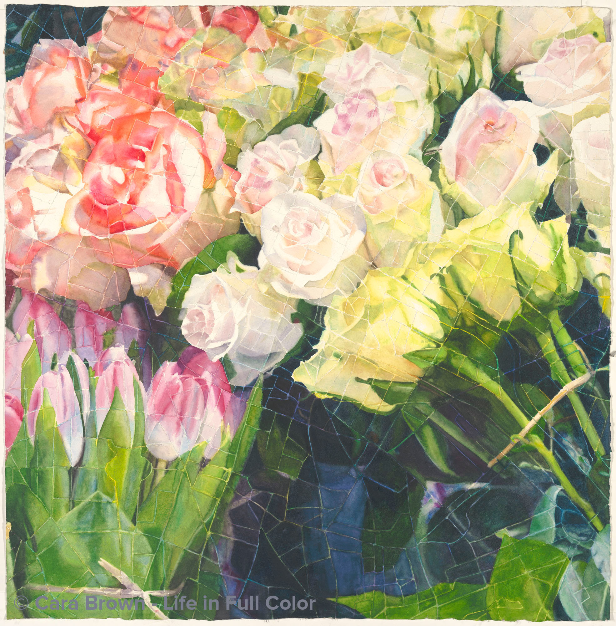
Paris
Original - My Private Collection
Shop Online
Archival Print Sizes/Prices:

These flowers were in a florist’s sidewalk display on rue Monge in the 5th in Paris – not far from my apartment when I spent half a year there in 1996.
Setting it up was a challenge which took some technical skills to pull off. If I simply enlarged a street map of Paris, the width of the streets would be so large that they’d obscure too much of the flowers. Using my projector and Photoshop, I was able to create a workable “screen” out of the map. In order to have a the right level of detail, I ended up including only the very center of Paris (not even the Eiffel Tower made it in) to superimpose over the image of the flowers.
This is an entirely different way to think and paint. I had to find the image within each of the shapes on the map. It was interesting to watch myself switching back and forth between concentrating on the image of the flowers and noticing where I was in the city, while either remembering when I’ve been in that spot or wondering what is there on that stretch of street – apartments, restaurants, bookstores? Even without the street names, I still recognize a remarkable number of streets and bridges.
I wonder if I’d painted this image as I normally do, from a contour drawing, if it would be as interesting.
I’m so grateful for the creative spark to explore ideas like this. Now which map/image combo is next?
I tossed around myself and talked about possible names several times with others. More involved names seemed forced, so I decided to keep this painting's name super simple. This is Paris.
May - June 2013 - 29"x29" - Watercolor on paper
Paris
Originals, Paris, Squares-Maps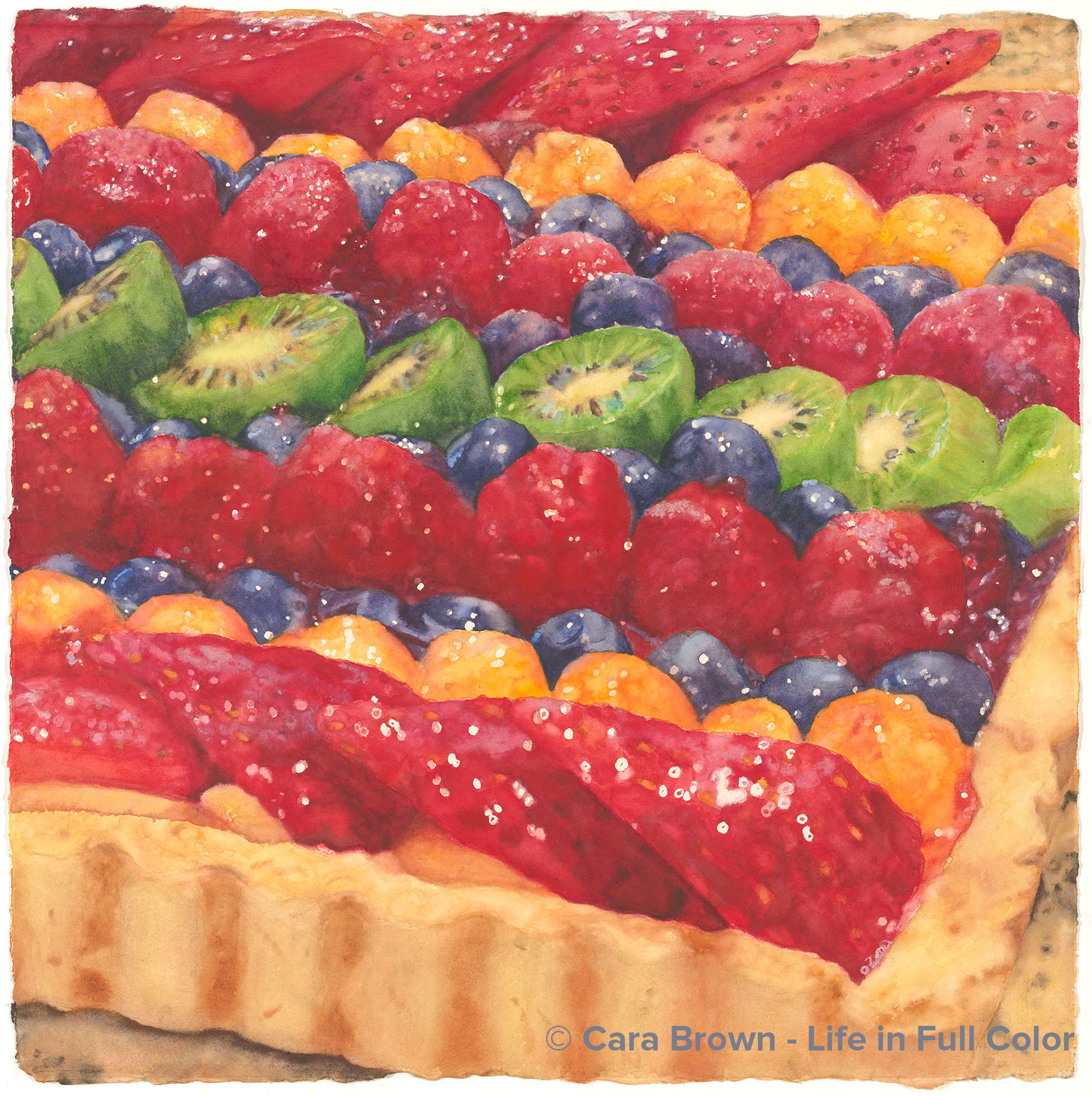
Bijoux
Original Available - contact me for details
Shop Online
Archival Print Sizes/Prices:
22"x22" - $395
15"x15" - $195
7.5"x7.5" - $60
When I painted the first fruit tart "Fruit Tart," I missed the color green in it. Every single other painting I've done before and since has had green in it somewhere - even "Fauchon Eclairs" has green-colored candies on some of the eclairs. So when I saw these tiny kiwi fruit in the market I bought some to make another fruit tart with them for a painting. I love to cook and actually think of it as my first art-form. I love making food beautiful, like these fruit tarts - arranging the fruit so the colors are pleasing is so satisfying. Whereas my creative process usually starts with a camera, sometimes it actually starts with making pastry! I painted this one differently than I usually do. Normally I paint the background to the foreground, painting the focal point last. This one I painted row by row. It was fun to see it take shape, like a wave of color working its way down the paper. All of my pastry paintings have some sort of French or Paris connection, this one is its name - I named it "Bijoux" as they seem like sparkly jewels sitting in their box of pastry.
February 2013 - 22"x22" - Watercolor on paper
Bijoux
Make me an offer, Originals, Sweets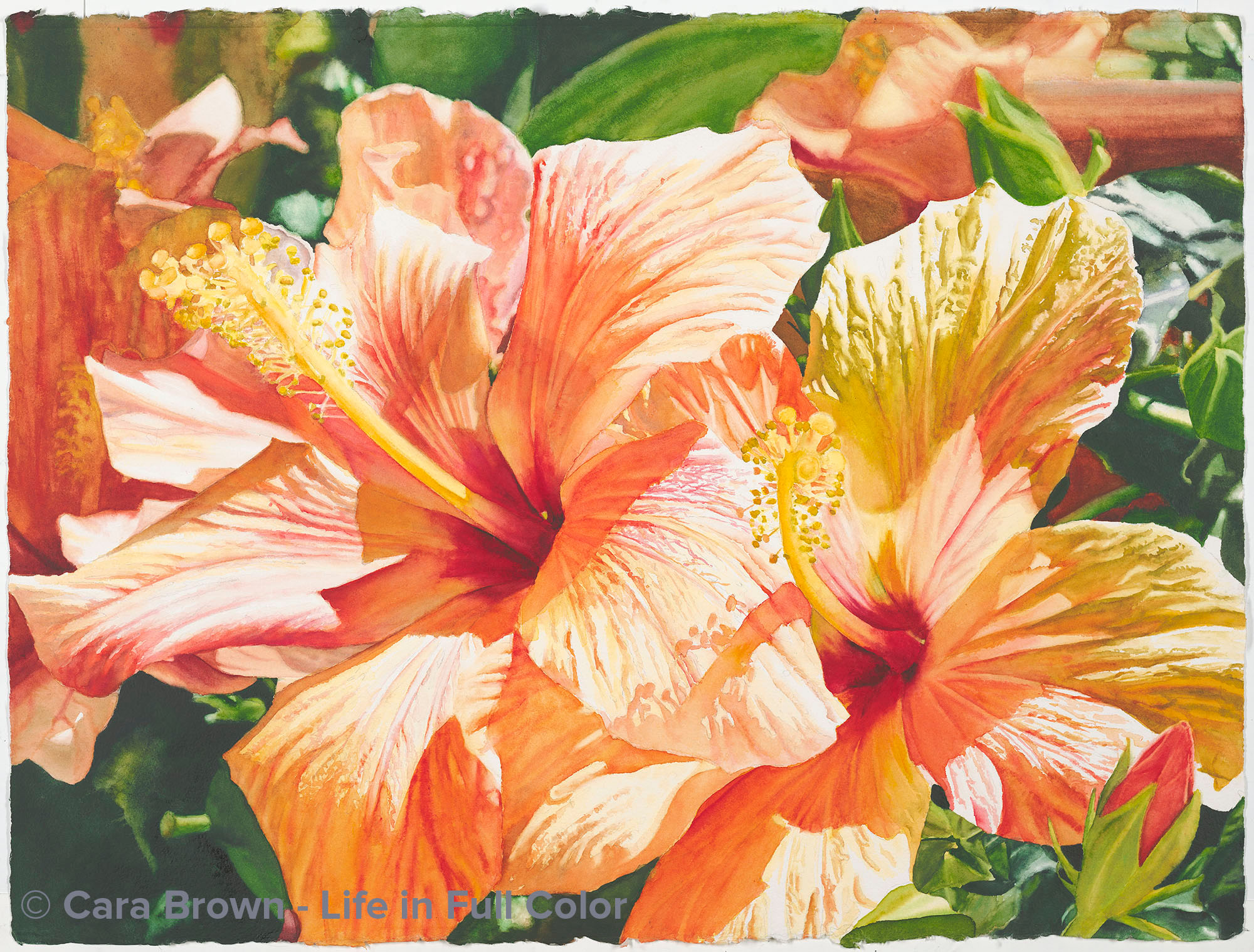
Dazzling
Original Available - contact me for details
Shop Online for Archival Prints
With all the trips to Kauai that we make, you might think these two hibiscus flowers were growing there, but they were in a pot on the patio outside our kitchen here in Fairfax (Northern California). They will not survive our winters without protection (we do get frost). In the summers, though, they are quite happy. Alas, this plant is not still with us.
It lives on in this painting.
Beside the yummy color, I liked this image because it has a sense of companionship - the two are aligned, facing the same direction. With all the work I'm doing with PAX and masculine and feminine and partnership, it really spoke to me. I had been scared of all the detail on the surface of the petals - there's a lot going on there. Recently I'm looking at why that is and realizing that it's the left brain that both is freaked out about the detail and makes mischief in the painting process. It so gets in the way of making good art.
It's useful for standing back and analyzing why a particular part of the painting doesn't read. I find that listening to music while painting helps keep the spacial right brain engaged - and it soothes the overworked left brain too.
My papa gave me the name - it was his reaction to seeing the finished painting. Thanks, Papa.
July 2012 - 22"x30" - Watercolor on paper
Dazzling
Make me an offer, Originals, Tropical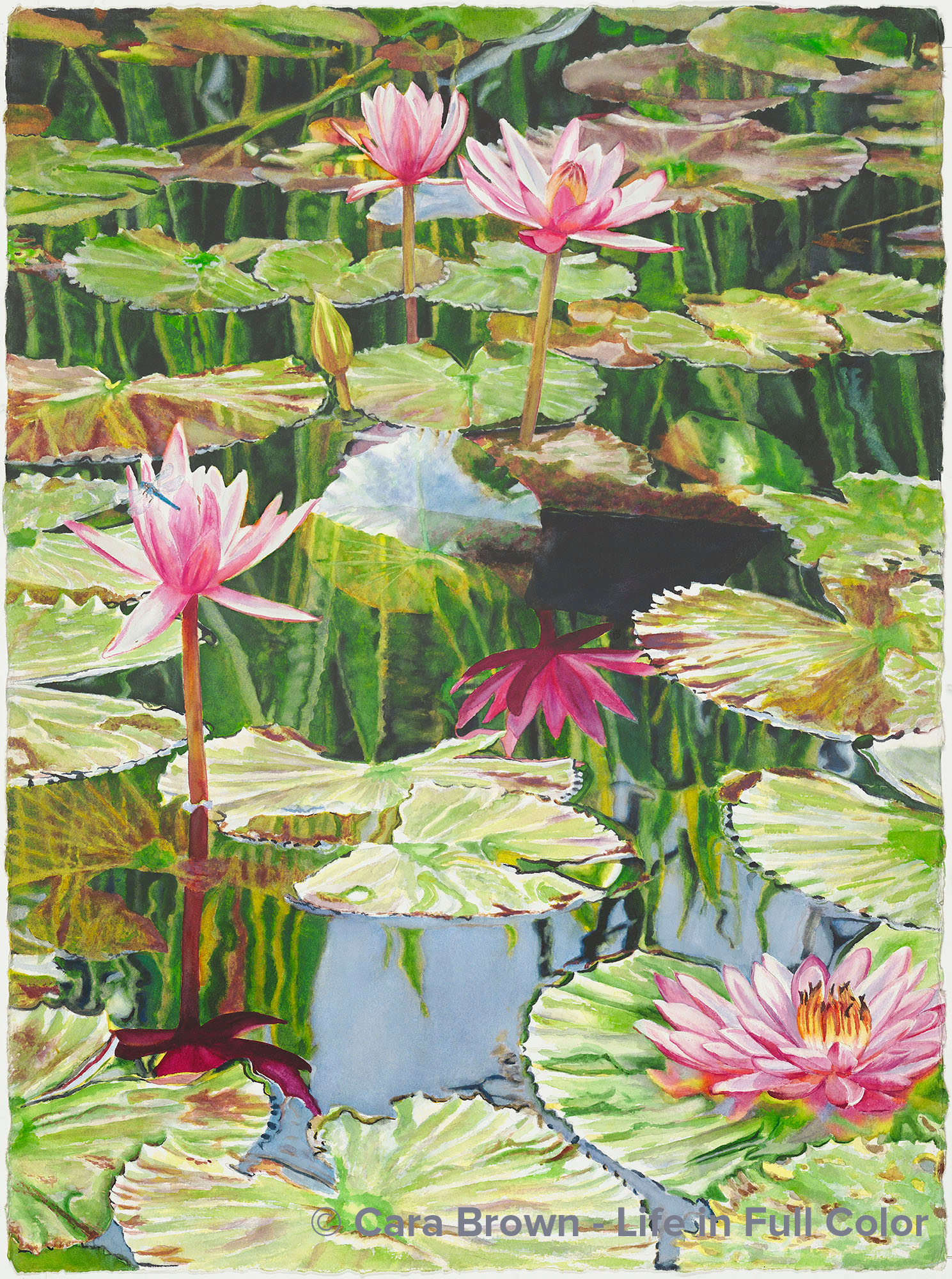
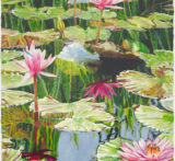
Lily Reflections
Original Available - contact me for details
Shop Online
Archival Print Sizes/Prices:
30"x22" - $495
20"x15" - $250
10"x7.5" - $75
These lilies are in a pond outside the Plantation Gardens restaurant in Kiahuna Plantation in Poipu on Kauai. When we go there, I often visit for painting ideas. In addition to the lily ponds they have the most extravagent collection of orchids I've ever seen! Though the same dimensions as the previous water lily panting - and the subjects are of similar scale - it still amazes me how different each painting ends up being. Paintings really do have a life of their own. A space of nearly two years between the painting of them and a whole other thing emerges. There's so much more going on in this one. The reflections of the lilies are the star of the show for me. In Southside Lily Pond, the light was such that the reflections had very little detail, nearly black. In this one, it was earlier in the morning, making the reflections the most full of color and richness. The reflections of the reedy succlulent plant growing at the back edge of the pond is also makes a big impact. There are differing opinions about the dark shadow in the center of the painting. I like that you cannot tell exactly what it is - it's mystery and murkiness. And it wasn't until I was really in close doing the drawing that I realized there was a little dragonfly or damselfly on the lily on left. So, I made it bigger and spread its wings in the tropical light.
March 2010 - 30"x22" - Watercolor on paper