Returning
Original Available - contact me for details
Shop Online for Archival Prints
This is one of those paintings that come from mining the treasures I collect and hold on to (sometimes for a very long time) before making them into paintings.
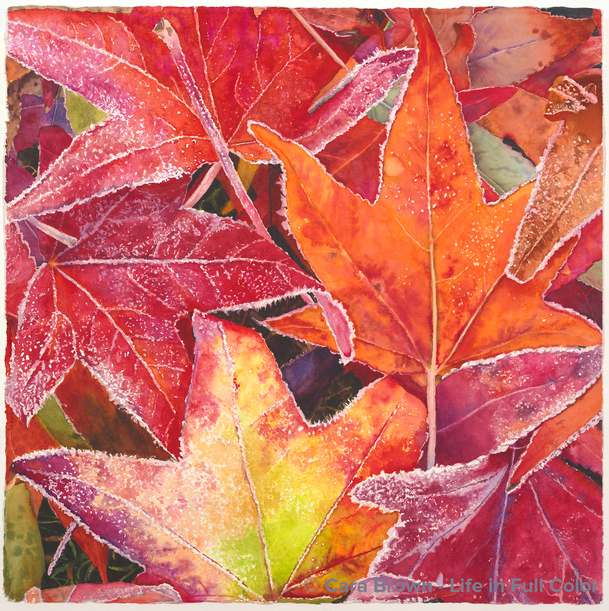
The timestamp on the photo is December 2006. I was coming home from hiking the hill near our house with our dog BJ. As we walked by the house down the street, the lawn next to the sidewalk was strewn with the leaves from their liquid amber trees, iced with frost.
My eyes landed on this one vignette of overlapping and turning leaves. Even though this is not a rare occurrence, I’m still amazed at the wonderful mystery of how we are caught by something so specific within a sea of visual information. It’s as if I hear “this, this, look at THIS!”
I dashed home for my little Canon Elf camera – this was pre-iPhone – to capture it before the sun came up enough to melt the frost.
Two forms of hesitation have kept me from painting it all these years: first, how am I going to take on painting this? All that frost! And then: who is going to want a painting of ice? Most people are drawn to all the warmth and sunlight in my work.
But I appreciated the fire-and-ice quality to it – the warmth even in the cold. So, there it rested, patiently, in my “candidates” folder.
When the world shut down and we all stayed at home the spring of 2020, there were two more Saturdays on the schedule of a “Basics and Beyond” series I was teaching. With the shift to Zoom, I felt compelled to come up with a new group exercise, since I couldn’t support each student working on a painting of their own choosing, as I do when we are in-person.
I decided to use a piece of this image for the session called “Lost and Found in the Details.” In the process of demonstrating how I’d paint the multiple colors around the white spots of the frost, I found myself really liking the result – and having fun!
Adding to the impetus to do a full painting of these frosty leaves was the idea that came to me to create the 2021 calendar with paintings of images that were captured within walking distance from home – the beauty found right here in our neighborhood.
The name has a few connotations: returning home from the hike, returning to capture the image of these leaves as they are returning to the earth at the end of the season. We turn and re-turn.
22”x22” – April 2020 – Watercolor on paper
Returning
Make me an offer, Originals, Shell and Leaves
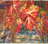
Kindred
Original Sold
Shop Online for Archival Prints
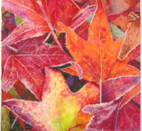
As popular as succulents are these days as a subject for paintings - and even sculpture – they’ve not ever appealed to me as such. One a cool January morning, as I walked by a neighbor’s front yard, this cluster of succulents catching the just rising sunlight jumped up at me, telling me to take their picture. Succulents have been quite popular in paintings, sculptures as well as in gardens these past years, but their allure has eluded me. So, I passed the image on to my friend Sue, who made a gorgeous painting from it.
Never say never, as they say. I used this image as a demonstration/exercise for a Saturday workshop that was re-routed to Zoom because of the pandemic lockdown. The process of demonstrating how to create volume by painting each of the leaflets, with their multiple blues and greens, combined with a soft yellow and deep blue-red for zing had me think: why not?
The 2021 calendar theme: a collection of paintings inspired by places within walking distance from home – as this was where the vast majority of us spent 2020 – made painting it even more compelling. With nothing to lose, I put it in the stream of things to paint.
It provided an opportunity to revel in my obsession with cobalt pigments; I used them all: green, turquoise, teal, blue and blue-violet. Mid-way through, though, I did find myself quite anxious to get back to the warm side of the color wheel – where I’m much more at home.
There will always be something quite special about this painting, as I worked on it in my parents’ bedroom while I kept my dad company in the last weeks of his life. As he dozed along with the National Geographic channel, I put blues and greens onto watercolor paper. Precious time I’m now so grateful I spent with him.
I really struggled with the name for this one. I wanted something that would reveal how I see how these plants all tucked in, one against the other, as we are – people sharing one planet. It’s a tricky needle to thread. I never want painting titles to either sound hokey or trite, nor like I got them from the dictionary – too specific and soulless. The one that fit that in-between place best was “Kindred.” There’s “kin” in it (we are all somehow related) and I liked that we usually find it followed by “spirits.” Which fits too - but it’s better that it is implied.
May we all know we are truly kindred.
22”x22” Autumn 2020 - Watercolor on paper
Kindred
Shell and Leaves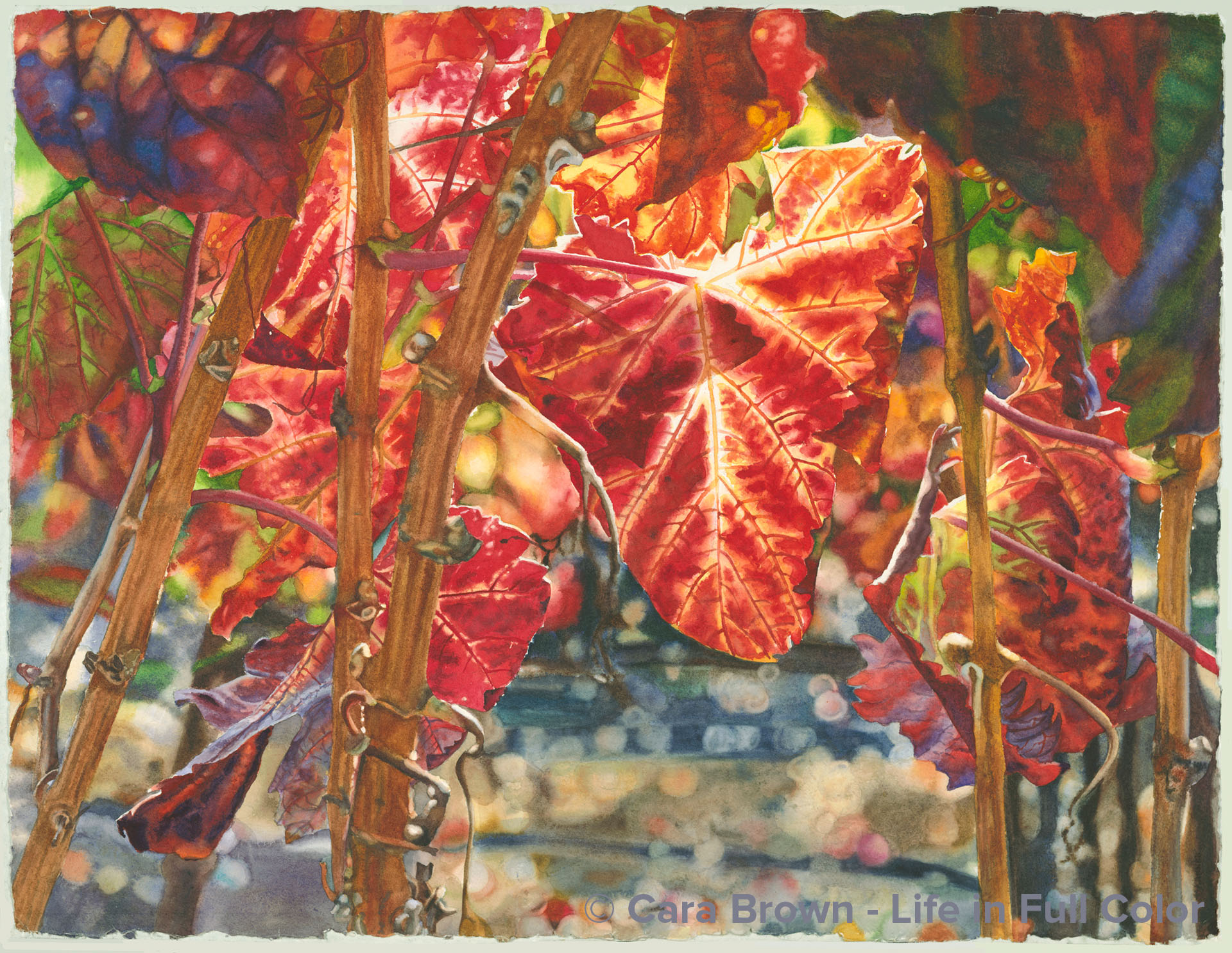
Napa
Original Available - contact me for details
Shop Online for Archival Prints
These leaves were on the side of Highway 29, the main route through the Napa Valley - it was late November or early December and I was coming back from a lunch at Greystone in St, Helena with Joanne - a dear friend visiting here from Boston. The afternoon sun this late in the year was already fairly low in the sky. The sunlight caught these leaves on the side of the road - making the reds and yellows incandescent. I am obedient to inspiration, so I pulled over on the rough shoulder and climbed between the wires of the fence with my camera.
As almost always happens, of the dozens of pictures that I snap (grateful for the freedom to do that with digital photography), one or two stand out – this was one of them. But a reluctance to paint it was there too. There were no grapes… the main leaf is curled and does not have much of a “grape leaf” shape… and through the bright colors and the lovely light, I felt a certain melancholy. I remember saying this image made my heart hurt in the best way. Who would want a painting of melancholy?
Fast forward a lot of years to October of 2017 when a great firestorm raced through this part of our world… I was painting some white wine grapes from an image I’d snapped on the side of Highway 12 in Sonoma – the Valley of the Moon. In the midst of the devastation and grief everyone around here was feeling – especially because of how beloved these areas are - it occurred to me to call the painting of Chardonnay grapes “Sonoma” and be brave enough to paint this one and call it “Napa.”
Being a meaning-seeking junkie, I had to know if the name Napa means something. It turns out the origin of Napa is a mystery. So it will have to suffice that these paintings are simply my connection to these beautiful valleys.
November 2017 - January 2018 - 22"x30" - Watercolor on paper
Napa
Grapes and Wine, Make me an offer, Originals, Shell and Leaves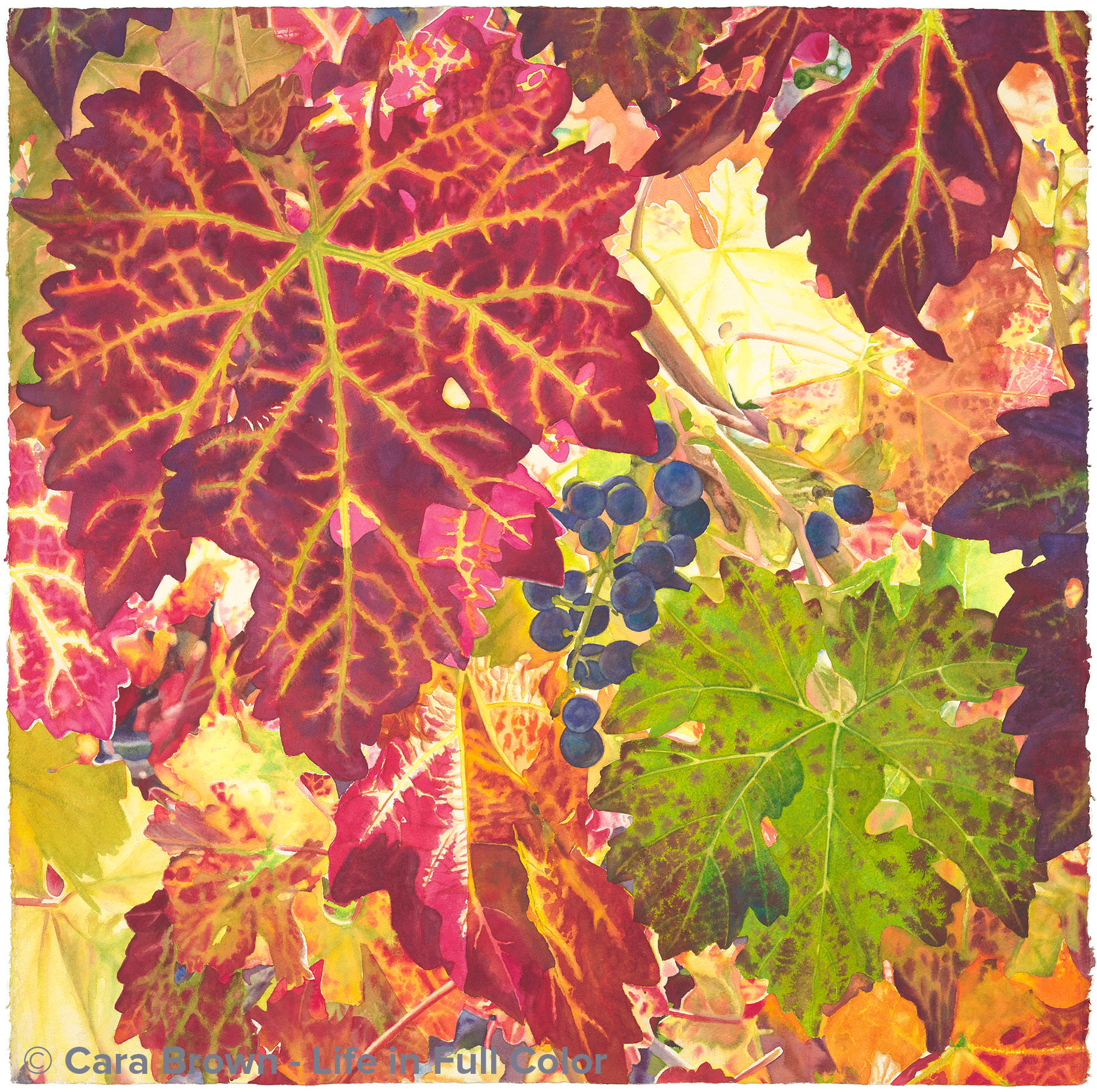
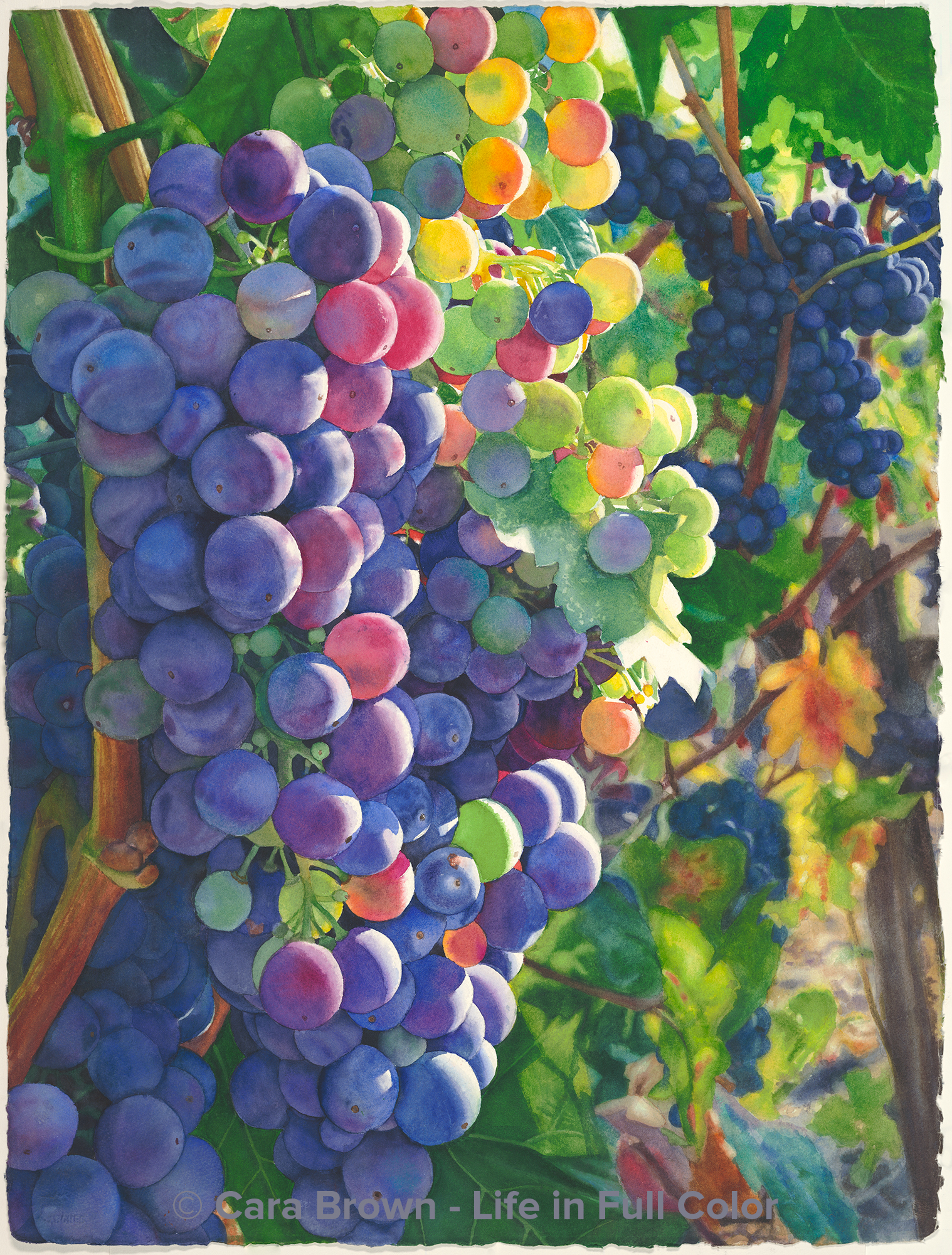
Rest
Original Sold
Shop Online for Archival Prints
In November of 2010, I took a trip up to the Valley of the Moon in Sonoma to meet Icarus, Beverley Terry’s stately Russian wolfhound so I could paint him. Joe suggested that, while I was in the area, I go check out a Christmas tree farm we’d heard about. It was on Moon Mountain, which is a very special place to my family.
For many years dad belonged to a San Francisco-based Italian men’s cultural club, called Il Cenacolo. They held an annual opera picnic at one of the vineyards owned by the Martini family up at the top of the Moon Mountain. My dad is one of the few members who brought his whole family. Mom has pictures of all of us and the kids (our nieces and nephew) at all ages over the years. It was always a Sunday afternoon in late September, when everything is cast in a golden light. The property, called Monte Rosso, because of the red, red dirt, was enchanting: an old white wooden house, a huge two-story stone barn and an enormous arbor that covered enough picnic tables to seat a hundred or more people – all surrounded by acres of ancient grape vines. We loved to wander around, duck under the enormous old fig tree to smell that warm fig tree smell. The food, catered by the Orsi family was always the same, nearly-burned lasagna Bolognese, barbequed chicken with herbs and garlic, green salad, French bread, zabaglione and berries, and of course the Martini wines. It was like a trip to Italy. The opera outing doesn’t happen there anymore. And we so treasure the memories.
Back to that November 2010… I was driving back down the road and one of the properties along the way – just someone’s home, not a big vineyard – had some grapes near the fence. The sun was coming through them so that the colorful leaves were all lit up. It was one of these moments I write about all the time in these painting stories. Something I see is so astonishingly beautiful, I must stop and take a bunch of pictures.
It’s curious to me why sometimes it takes a few years before then I make paintings from these photos. I think I had doubts about whether this was really to be part of my work. It’s quite different. For whatever reason, I started it right after this year’s (2014) Sausalito Art Festival, in the hopes that I’d be able to jam to get it finished in 2 ½ weeks, in time to show it at the Healdsburg show, like I did last year with Zinoasis. With about a week to go, I decided against pushing. The name of this painting had already occurred to me. I liked the double meaning of “rest” – one being the remainder, the leftovers, the grapes passed by. And the other, the season the vines were heading into, when they aren’t working to push out new canes and leaves or ripen fruit – it’s when they go dormant – to sleep. This is something that I find myself craving more than ever, to have deep, restful sleep as well as some time to be not feeling like I need to be producing something – some rest! Given that I was considering giving this name to the painting, it followed that I’d not bust my butt to paint it! So I've taken another month to finish it, enjoying the idea of painting it in the spirit of its name.
I continued in my inclination of late to limit my palette. The rusty-maroons are a mixture of Pyrrol red and Cobalt blue. The greens are mixed with my new-favorite Cobalt teal. Beyond those three pigments are a few yellows and a couple of quinacridones (coral and rose). I really let myself be less precise in how I painted than ever and it was fun, and more rest-ful. I’m not sure that these hot and bright colors are exactly what many would associate with the word “rest,” but it’s very clear to me it is the name of this painting!
October 2014 - 29"x29" - Watercolor on paper
Rest
Grapes and Wine, Shell and Leaves
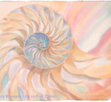
Divinity
Shop Online for Archival Prints
This was a fun painting!
I painted it in a just a week – super fast in my painting life. It was done as a gift of appreciation for someone who is really generous to Joe and me. She is in my painting group and had attempted to paint a shell like this on a full sheet of paper herself, but gave up on it.
My mom gave me a nautilus shell – just like she was trying to paint - a long time ago; it sits on the vanity of my bathroom. I looked at it one day and had a burst of inspiration – I could paint this for her!
I started with the blues in the middle and painted it section by section, spiraling out to the big wide section where I could use a big brush and be loose and washy with the paint.
There are just three paints here - giving it harmony and unity. It’s always freeing (in a paradoxical way) to limit the number of paints in a painting.
I wasn’t going to share it here, as it didn’t seem as “serious” a painting. But then the reaction to it was such that I thought, why not?
I gave it the name Divinity, partly because it spirals out like cosmic energy, and partly because it is like soft, sweet old-fashioned candy – and partly because it just fit.
22”x30” – July 2019 – Watercolor on paper.